Showing posts with label Company magazine. Show all posts

05/09/2014

Company Magazine, Natalie Lines Fashion Illustrations

Ok Ladies and Gents, the sad time has arrive, it's the last printed edition of Company magazine, and I am truly sad. As i've mentioned before I absolutely adored company for years now, they gave me my first illustration break, and really believed in me, I thought the magazine was going in an amazing direction with unique content and brilliant staff, i'm glad to hear they're continuing online though. These are the latest pieces i've done for them, and I am over whelmed at how lovely they look! The theme was bright bold colours with dramatic eyes and lips, It took a lot of work to get them here and i'm massivley proud with the result. I'm happy to say that you can buy one of these illustrations in A4 for £10 or A3 for £17 HERE. I'd love to know what you think of these drawings as they're a little different to my usual style!


One of the first looks which was due to be published (below) but i had to change it around to feature the pink and blue look instead, I really wanted to show this piece as i really did love the oranges and blues together, As i mentioned before, get a lovely print HERE and pop it on your wall. I think it's so striking with the burnt orange hues. 


Make sure you pick up the final copy, it's bursting with beautiful fashion tips, expertly designed and all over lovely! Have you also seen that you can win one of my newest Illustrations? Either Retweet, share on Facebook or Regram to place your entry to the giveaway, Exciting hey! 


16/08/2014

Black and White


I finally got hold of one of my favourite statement pieces this week, Leather trousers! (not real leather) but just as lovely. I wanted to wear them with just a simple plain white t-shirt. I also borrowed my mums long black duster coat to wear over the top, the combination of textures works really well together, however i'm not too keen on the A-line shape of the coat, (hence the lack of full length photographs)  The bird skull ring is from ASOS and the rest of the rings are from H&M. 


14/08/2014

A few years ago I decided to try and make the whole illustration thing a way for me to make money, it was an enormously scary decision and I was so nervous about really trying to do this as a living. I saw Company Magazinehad an illustration competition and decided to enter, I didn't win but the art director really liked my work and wanted to commission me for my first published fashion illustration, I soon found out how passionate they were about new talent, art and fashion. They took a chance on me and made people take me seriously. if anyone comments on my work it's because they've seen it in company. I'm sad to hear they're going but I wanted to thank them for letting me be in the magazine over 14 times with my drawings. You're going to be missed.


08/07/2014

Watercolour Lips

5/20 My newest illustration, created with a mixture of digital and traditional techniques. This was a really challenging piece, I couldn't quite get the teeth right, and It took a lot of tweaking before I was comfortable to release it, I was really glad it only took around 4.5 hours to complete though! What do you think of this? are you liking the new colours i'm using in my work? 


04/07/2014

Day 2! So, uncomfortably and unwillingly I was encouraged to use more colour in my work, Usually this doesn't go well for me, which is why I'm never too eager about it. However I chose to use some watercolour washes in my work this time and decided to use them in a different way, adding other hues and colours, making them look a bit more interesting and less flat, surprisingly it worked, I increased the saturation through photoshop to make them pop a little more with some curves, which seemed to give a really warm bright look to the finished piece. I was concerned that working on a new illustration every day would harm the quality of my work, I had the idea that rushing my designs would mean I would sacrifice the detail that I love to put in, But i didn't allow myself to do that, I worked extra hard and made sure I was creating content that I was proud to release, when it comes down to it I'd always chose quality over quantity, It's also made me make decisions quicker, which is where I think i was going wrong before when experimenting with colour, I'd over-think the process too much and never let it grow enough to enjoy the finished product. I've seen that coming out of my gothy comfort zone has really blown away some cobwebs and let the creativity flow again. Make sure you check back tomorrow for a new Illustration. Day 3 is going to be a little different.
 big Thank-you to Elliot for making me try colour again.


 This print, along with the shoe print from yesterday is now available HERE for £10 


29/06/2014

Company Magazine July


Hello! My new illustrations for company magazine have just been released in their July Issue, it's about amazing festival make-up, featuring my illustrations, I worked so hard on these and wanted to make sure all the colours were bright, and popped.  I loved this project, lately I've felt that my work has taken a big leap and i've definitely made a conscious effort to spend a lot more time to get that extra detail in, At the time it's hard to see the difference but comparing it to old work makes me feel a lot better!

Do you see a difference in my work? I've uploaded a high-res Gif of the new illustrations so you can see some details, i based the different looks over one eye so you can really see the affect different shapes and colours have on an eye. My favourite is the orange and purple look, the colours are so punchy! 


12/01/2014

New Phone Cases!

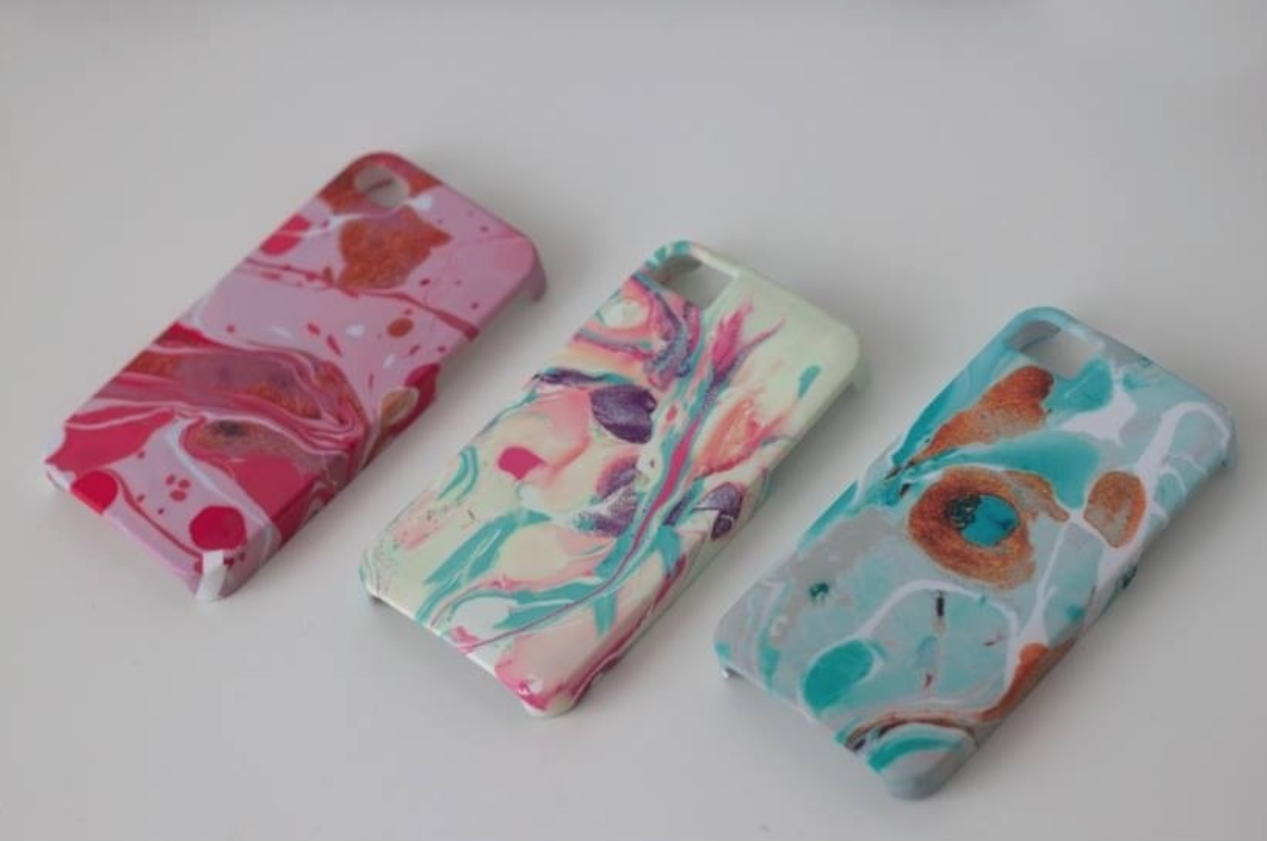
I'm super excited to show off my new phone cases, i've been wanting to do these for ages now, after having some bad experiences with other suppliers, (late delivery, dodgy colours and worse quality) It gave me the nudge to actually do this myself, and why not? I love making things, I can test out one offs and really get a feel for the market. I'm really lucky to have the chance to do this so i'm going to try and make it work the best I can :)
 Below is one on my best sellers, I put it online and got so much support from everyone about this case, created by marbling I added my favourite pastel tones to create this. It was tricky to get right on the phone cases, but i'm really pleased with the result :) I'd love to see photos of your phone if you purchase this!
 Did i mention it's only £10 from here

I've also been playing with other images, The other two shown below are from my marble collection too,  The first is the pink and gold, a great feminine case, with lovely contrast and bold colouring, the middle is the Pastel Case from above, and Lastly is the Teal case, a real sensitive and subtle case with gold flecks and light washy colours. 


Above are my newest additions! my hand-drawn illustrations freshly printed on white cases!

 I'd love to know what you think about my cases, I'm going to continue experimenting with all of them, making new ones and seeing what sells, so keep up to date as there's loads to come on shop.natalielines.co.uk 


10/01/2014

Company Magazine Illustrations Part 2


Le Flick! The second Illustration commission for Company's Paris Issue!
I'm so excited to show you these lovely eye makeup catwalk looks, all taken from the biggest shows on Paris Fashion week. My favourite is the Alexis Mabille, it's just so elegant and a style that really suits anyone, not to mention it's created the trend which we're seeing on everyone lately.


They're all different eyes, I created them all black and white at first but along side the colourful chanel look, it appeared realyl stange, so some colour was needed to balance it all out,  I kept the hues of the eye colour quite similar as i wanted the black pencil marks to really be the focus, i rarely draw with such dark heavy strokes, but I wanted the eyes to be in the same focus as the make-up and not look like an afterthought, Anyway, I hope you get to read this issue and see it in the flesh for your-self

 Natalie xx


Company Magazine Paris Issue Part 1

Bonjour! I was so excited when i heard Company magazine were planning a Paris issue for their February Magazine, and I HAD to get involved, i was absolutely thrilled when I was asked to create an illustration of a perfume bottle with a french scene involved. I added lots of bokeh lights and made it very dreamy with the use of pastel colours, pinks and creams. It was a joy to make, lots of hard work and refinements but I hope everyone is pleased with the outcome!
A little close-up of the french bicycle I drew. I added hints of gold glitter to pop against the muted hues.

And how it looks in the magazine! I was really pleased it turned out so well and I love the graphic design along side it! The paris issue came at such an amazing time, I was already wanting to go to Paris, I want to sit and draw all the little cafes and go shopping. Hey, a Cliche is a cliche for a reason, right?


est-ce que vous aimez?


And how it looks in the magazine! I was really pleased it turned out so well and I love the graphic design along side it! The paris issue came at such an amazing time, I was already wanting to go to Paris, I want to sit and draw all the little cafes and go shopping. Hey, a Cliche is a cliche for a reason, right?  ;)

I'm deinfietly going to plan a trip now, and with all the company tips in the magazine I can't wait!
 Anyway, thoughts on the illustration would be greatly appreciated.

Natalie x


05/12/2013

Christmas Cards

Well, It's December, Already! Where has this year gone?
 We all had goals and ambitions for the year, mine was to gain more exposure within the Illustration word.
set up a shop! (DONE)
 and, I think, to explore my artistic style a bit more.

I do think i've achieved a little of it, i'm never 100% happy with my work, but i'm ok with that, personally i don't think i'll improve if i'm content (I think i've said that a lot)

I've made some really girly Illustrative christmas cards, they're luxurious, pretty and delicate, and are perfect to send to those friends who love Fashion and all the stereotypical girly things I adore too ;)
I wanted to experiment with the pink and gold colour palette, I think it works really well as a christmassy Card to go along with presents or as a gift card, After xmas I will be selling these as Happy Birthday Cards too!

They're £5 for a pack of 5! or £1.50 each
The pack can be a mixture of the two designs or of one only.
It's up to you, but be quick, They're selling out :)
You can buy them HERE


16/07/2013

New company magazine beauty illustration

Recently I got commissioned to draw some makeup products for company magazines beauty article! It's all about saving your makeup when it's broken, getting those extra bits out of it so you can continue using it,
 I've lost count at how many times I've dropped my pressed powder and its shattered :( so I was excited to start the drawings and go for something a bit brighter, as I've mentioned before my work is very pale and although its a current trend I do want to show some versatility ;) 
 We had discussed a beauty table and box for the piece, however I thought that it might take the focus off the makeup as its be quite small within the frame, my first drawings were playing with images on a dresser like an old telephone, I battled with this and couldn't get it to look how I wanted.
Sometimes I cut my losses and start again, otherwise I end up wasting time and achieving nothing when I could have been half way through something really good, other times I try and push through if I feel like there's potential in the piece. 

This is the image I started with, I don't mind where it's going, but the lack of detail really stops me from connecting with it, I've also got a problem with the water coloured chair back,  
 I'm glad I went with another approach and it was received well thankfully! We upped the saturation and added a bit of sparkle, which I think made a big difference 

Here is a close up of one of the first drafts I sent over, as you can see a bit more work went into this but I was pleased with the direction it was heading.  The box was a little frustrating but the more detail I put in it the better it looked (obviously hah)
 I added a little bit of sparkle on the pots and in the eye shadows, I just adore the way they shimmer so I wanted to try and emulate that a little within the illustration.
I experimented with some other hues, I really like the purple and pinks but it is a common colour of mine so it was suggested that some turquoise and blues should be added, which worked really well, you can see the finished piece below, I added a few little plasters on the pots to keep in with the broken theme..


I certainly have the itch to draw more beauty products now and expand my portfolio to other things I love! I started drawing some macaroons soon after, they took hours! They were extremely time consuming but well worth the finished result. 

I loved adding the little flag, I then went on the draw a few more below, I wanted to add some colour to them, maybe a blue/turquoise, but it really didn't look right so I removed it and kept the only colour the sprinkles and flag.
Final image!
 Thanks so much for reading, I always appreciate the comments, I hope you get chance to read company and see my new work :) 


13/06/2013

Listen and tweet illustration, company magazine.

Hello!
As you may know I regularly illustrate for the #readitandtweet section in company magazine, I've also just started with the #listensndtweet section too. I love how involved twitter makes you, especially with the use of hashtags, my newest illustration if definite my favourite I've done yet!
I used a reference image of my sister, as she looks quite young I changed the face around keeping the pose the same, I tired to add a little more texture by drawing a jumper with a knitted look to it, it took hours! All individual pencil marks, but looking back I think it's why it's my favourite illustration, taking an extra few hours to tweak and concentrate on detail really makes the difference. 

I'm ashamed to say I use way too much pink in my drawings, I know I'll look back at my portfolio one day and hate myself for it, so I made a very conscious decision to exclude any girly pink hues, having done that I think it works well with this piece, it's still a little subtle with pastel tones but I wanted the lips and jumper to really pop, I think I'm going to explore this style a little more and try and refine it making it identifiable with me, it's not going to be easy but I'm loving having the chance to experiment.

Next month a new illustration will be featured in company showing some make up drawings I've done, it's a really cool article and its a massive honour to be asked to draw time after time for a magazine which is not only awesome, but filled with really lovely people! <3 I do pinch myself sometimes.

Sneaky look! Shhhhhhh x 
Thanks for reading 
Nat x

13/03/2013

Company magazine illustrations

Woah, nothing wedding related Natalie? That is a shock!
 Considering most of my followers are more likely to be interested in my illustration work, i think i should probably post about it, I'm currently sat on a bed eating American candy, flicking through Company and wondering what to write..

I couldn't find a paper copy of Company today so I bought it on my Ipad which i've never done before, I'm now hooked! i love having a magazine when traveling, but having them all digitally saves me loads of space and i can indulge without feeling too guilty, (they're loads cheaper if you want to buy a years subscription)
However working in printing I do enjoy flicking through pages and.. at the risk of sounding like a loser I do love having a hard copy now and again,  plus my Grandma always wants a version, bless her


I was asked by Company to illustrate three ladies who are quite influential in the music industry, i really enjoyed the project and tried to incorporate things that were mentioned in the article that related to each girl.

One of my favourite illustrations was for Sarah, she mentioned how making a good impression was vital, making cups of tea for the right people is something everyone has to do! I drew a few cute little cupcakes and pots of tea to link in with the interview.
I can relate to the tea making, however as a non tea drinker please be aware if you want a drink from me I've had bad feedback ;) I'm more of a Hot chocolate girl,


Perry from little mix was another little illustration featured within the larger one of Anya (Syco A&R)
 I loved using watercolours in this and partially shading her hair, i'm going to explore this style a bit more i think..


I've also got an Illustration in the #Readitandtweet section, I'm looking for a nice new book to get addicted to as i've just finished the Hobbit, What are you reading?


Anyway, what do you think? I'd love to know if you liked the feature, for anyone looking to get into the music industry it's really worth a read, networking is they key
#GirlPower