27/10/2013

Marbeled Phone Cases

It's a horrible blustery day (for a change....) so i've decided to get back into some crafting and step away from drawing and the computer for a while, it's been really refreshing and much needed.
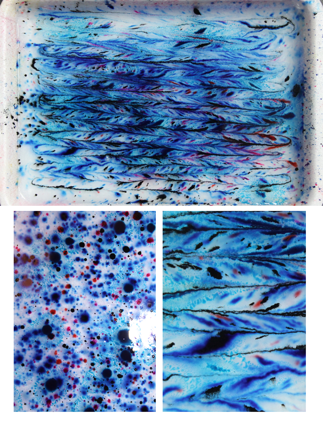
 I've adored making these cases, instead of moving them around in a definite pattern I decided to let them bleed out naturally and blur with the colours I added. I decided on selecting certain colour themes for each one. As before i'll be selling these for £10 each for iPhone 4/s and 5!

I'd really appreciate some feedback on which ones to print first


I think the first is my favourite, it reminds me of a aerial photos of glaciers and mountains.


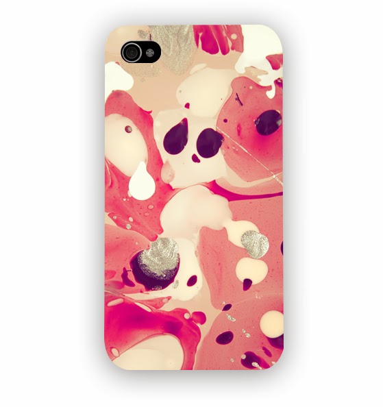
And I think the second has a little face in it which I cannot un-see now!
I created these and photographed them as I can never get a print from them with paper and it completely ruins it all :'(  I then edited them in photoshop, you can see below what they look like before I tweak them,


21/10/2013

River Island Illustration

The River Island campaign is EVERYWHERE at the moment, and i just love the styling, each time i saw an advert i thought about illustrating it, finally i had the chance and decided to create something.
 I really like the first WIP drawing below, especially the half tone hair and the thick edges.


I gave the hair a little more attention and used some watercolours within the hat and jumper,
I really like the added detail as it looks finished now, but it still has the abstract feel which i wanted to keep!

River Island spotted my Illustration and posted it on Instagram!
Crazy


16/10/2013

Illustration of Zara's top picks

Hey all!
 I've been loving the outfit posts people have been creating, and wanted to do one myself. I decided to illustrate it instead, all the lovely pieces are from Zara,


30/09/2013

New Artwork for Christmas Shop


So excited to tell you all that from the 4th October for three months up untill christmas i will be showing my work off, with a bunch of other creatives at a christmas shop in Litchfield!

 I will be selling lots of my cushions, phone cases, notebooks and illustrations, so if you're near i'd love to meet you  :)


Excited to show all the new things going on! x


15/09/2013

Phone Case Designs

New designs! 
 I was designing all night and just completely hit a wall, lack of inspiration and feeling a bit deflated.

 I have a ridiculous amount of inspirational books at home, so I decided to have a flick through them, they had lovely batik and hand embroidery examples in, it reminded me of marbling which I'd done a little of in college. I rumaged through the Internet for ingredient lists, It all seemed a little expensive so I thought I'd buy a starter kit, just to see if the process was something I wanted to persue.

The kit came with the primary colours, In little pots which are extraordinarily hard to get the inks to come out of, after snipping them and having my hands turn red to purple to a horrible muddy colour I finally got something going.

I added the thickener to the water, it says "the water should thicken slightly" .... It turned to the consistency of wallpaper paste which I thought would be too thick. I added the drops and started to build it up, I used red and blue, then added some yellow, once I was happy I decided to make some patterns,

 And it looked vile. Awful, terrible. I poured it all out and started again, this time I made the water less thick, and the inks sunk to the bottom. Ha :(
 Next I went back to my original wallpaper paste thickness and decided to stay away from the horrible primary colours and mix my own, I used various reds and swirled them together, it was absolutely perfect this time and I enjoyed every second, once the annoyances are out of the way you can finally have fun. I'm sure it just takes a tiny bit of practise, but being impatient and impulsive I'm always eager to have the finished product. 


Next, I added the paper to make a print. Is there some kind of technique? Or witchcraft? It didn't work for me, I took lots of high res photos, which I used to make prints from, and just as well really, I placed the paper provided on top, and pealed it back eagerly, To find a massive smudge all over the paper and no sign of the delicate pattern which was there at one time.


Never mind, it was a bit disappointing and I didn't get it to work once but the process was fun and I was extremely pleased with what I managed to do.
 I have lots of ideas for the prints, one if using them as these phone cases.


They'll be £12 each and available on my etsy and soon my brand new website! 


Any thoughts?

16/07/2013

New company magazine beauty illustration

Recently I got commissioned to draw some makeup products for company magazines beauty article! It's all about saving your makeup when it's broken, getting those extra bits out of it so you can continue using it,
 I've lost count at how many times I've dropped my pressed powder and its shattered :( so I was excited to start the drawings and go for something a bit brighter, as I've mentioned before my work is very pale and although its a current trend I do want to show some versatility ;) 
 We had discussed a beauty table and box for the piece, however I thought that it might take the focus off the makeup as its be quite small within the frame, my first drawings were playing with images on a dresser like an old telephone, I battled with this and couldn't get it to look how I wanted.
Sometimes I cut my losses and start again, otherwise I end up wasting time and achieving nothing when I could have been half way through something really good, other times I try and push through if I feel like there's potential in the piece. 

This is the image I started with, I don't mind where it's going, but the lack of detail really stops me from connecting with it, I've also got a problem with the water coloured chair back,  
 I'm glad I went with another approach and it was received well thankfully! We upped the saturation and added a bit of sparkle, which I think made a big difference 

Here is a close up of one of the first drafts I sent over, as you can see a bit more work went into this but I was pleased with the direction it was heading.  The box was a little frustrating but the more detail I put in it the better it looked (obviously hah)
 I added a little bit of sparkle on the pots and in the eye shadows, I just adore the way they shimmer so I wanted to try and emulate that a little within the illustration.
I experimented with some other hues, I really like the purple and pinks but it is a common colour of mine so it was suggested that some turquoise and blues should be added, which worked really well, you can see the finished piece below, I added a few little plasters on the pots to keep in with the broken theme..


I certainly have the itch to draw more beauty products now and expand my portfolio to other things I love! I started drawing some macaroons soon after, they took hours! They were extremely time consuming but well worth the finished result. 

I loved adding the little flag, I then went on the draw a few more below, I wanted to add some colour to them, maybe a blue/turquoise, but it really didn't look right so I removed it and kept the only colour the sprinkles and flag.
Final image!
 Thanks so much for reading, I always appreciate the comments, I hope you get chance to read company and see my new work :) 


13/06/2013

Listen and tweet illustration, company magazine.

Hello!
As you may know I regularly illustrate for the #readitandtweet section in company magazine, I've also just started with the #listensndtweet section too. I love how involved twitter makes you, especially with the use of hashtags, my newest illustration if definite my favourite I've done yet!
I used a reference image of my sister, as she looks quite young I changed the face around keeping the pose the same, I tired to add a little more texture by drawing a jumper with a knitted look to it, it took hours! All individual pencil marks, but looking back I think it's why it's my favourite illustration, taking an extra few hours to tweak and concentrate on detail really makes the difference. 

I'm ashamed to say I use way too much pink in my drawings, I know I'll look back at my portfolio one day and hate myself for it, so I made a very conscious decision to exclude any girly pink hues, having done that I think it works well with this piece, it's still a little subtle with pastel tones but I wanted the lips and jumper to really pop, I think I'm going to explore this style a little more and try and refine it making it identifiable with me, it's not going to be easy but I'm loving having the chance to experiment.

Next month a new illustration will be featured in company showing some make up drawings I've done, it's a really cool article and its a massive honour to be asked to draw time after time for a magazine which is not only awesome, but filled with really lovely people! <3 I do pinch myself sometimes.

Sneaky look! Shhhhhhh x 
Thanks for reading 
Nat x